


PROJECT
#unify
SERVICES
Creative strategy
Brand Identity
Art Direction
Digital design
Naming
Copywriting
Brand Guidelines
CLIENT
Dr. Paul Zeitz
We were asked to design the new brand identity in a way that it could be flexible and grow with this global movement within the next few years.
The goal was to join forces with other organisations, parties and movements to combine forces.
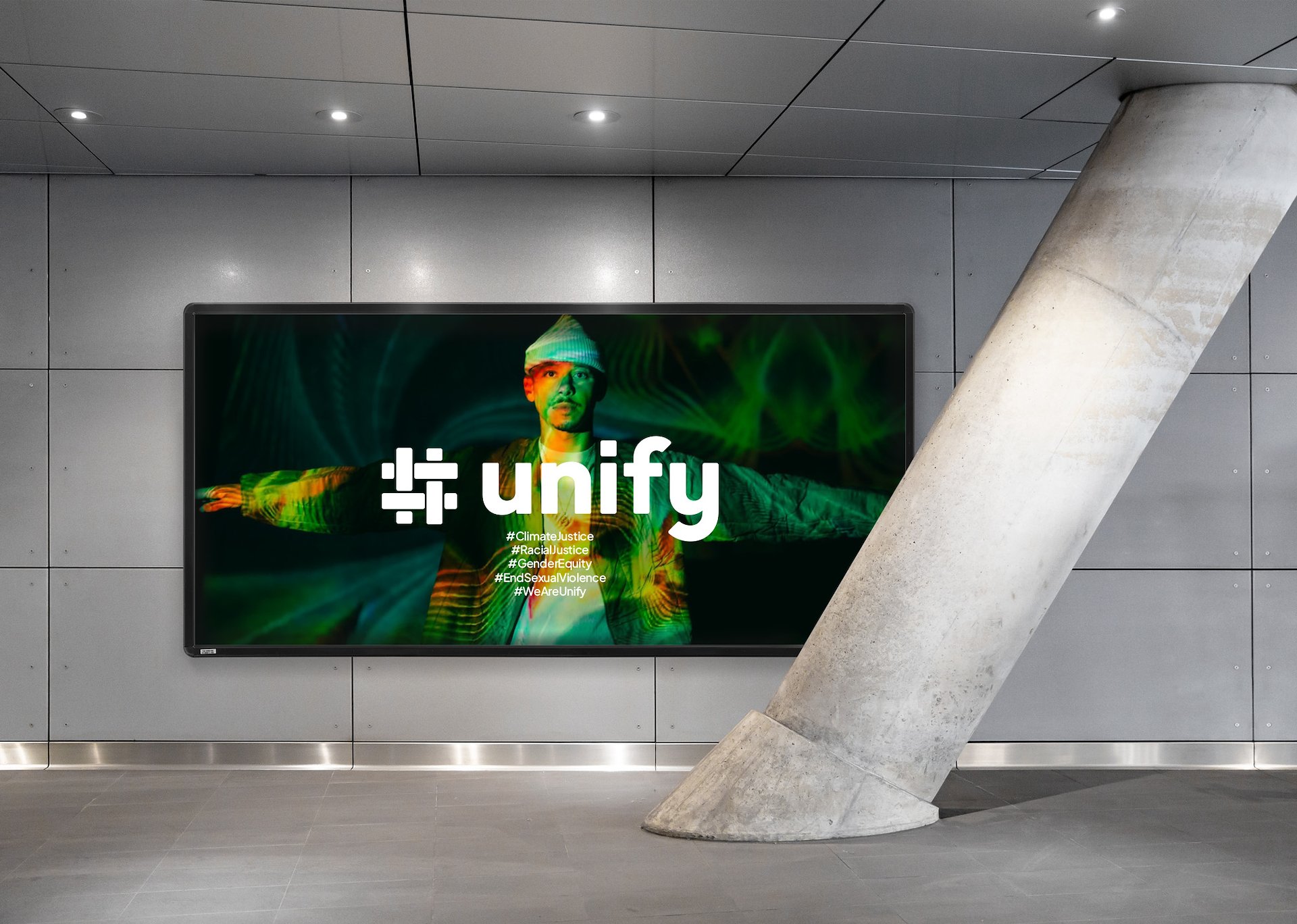
#unify’s concept is one of weaving and intertwining. Joining forces for the greater good of the planet and humanity. The logo contains a hashtag, hereby making the logo more of a active verb than a noun.
The hashtag forms the basis of the idea of collaborating and weaving a new fabric for the future. Harnessing the power of collaboration and interconnectedness to create a united society that can drive transformative change to solve the polycrisis together.


The logo
Unify’s concept is one of weaving and intertwining different parties. Joining forces for the greater good of the planet and humanity. Harnessing the power of collaboration and interconnectedness to create a united society that can drive transformative change to solve the polycrisis together.


The colour palette
The colours take their cues from nature to reflect balance and renewal. Lemon brings energy and optimism, lavender adds a sense of calm and creativity, forest conveys depth and resilience, and mint introduces freshness and growth. Together, these colours create a harmonious yet dynamic identity.


Photography
The photography focuses on real moments of collaboration and change—people working together, tangible progress, and diverse communities. These visuals are paired with approachable typography and clean graphic elements, keeping the design grounded and authentic. The overall tone is empowering and youthful, a visual call to action that’s as confident as it is hopeful.


